Graphic Design Situations - Post #2.5
I really enjoyed learning about the basic principles of graphic design through the Lupton and Phillips reading! Although, I am not very graphic design savvy, I feel as though I am subconsciously still implementing some of these concepts into my own work. I really liked the examples of using texture to create emphasis on page 68. In my two dimensional analogue work, I heavily rely on texture to create emphasis (even though the works may not exactly be graphic design oriented). It is nice to take a step away from the intensity of my religious Pedrolino and focus on a more meditative, and dare I say mindful, extension of my portfolio.
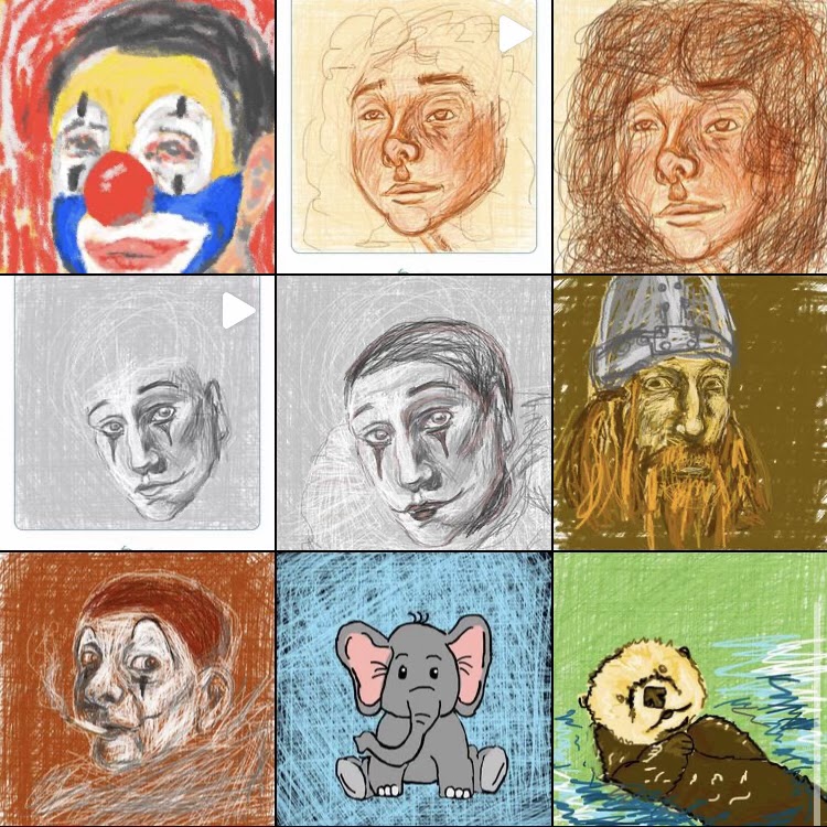
As for my half hour NoteIT doodles, I find myself leaning into the color aspect rather than the texture. I was also finding it incredibly difficult to add dimension to my doodles. After five or so doodles, I am learning that it is much easier for me to manipulate the two dimensional analogue drawing than digital (I know NoteIT isn't the greatest form of digital drawing, I am just a traditionalist).
The NoteIt drawings quite simply lack dimension and texture, even with the brushes that supposedly mimic real life. The doodles are diametrically opposed to my charcoal drawings, but I don't think that one is better than the other. They are both self indulgent, and I suppose I do not mind.
Ciao,
Sophia


Comments
Post a Comment